How to Make an Intro That Hooks in 3 Seconds
You’ve finished the video. The product looks good, the edit flows, and the payoff is useful. Then you watch the opening and notice the logo, greeting, title card, and slow camera move consume the moment when a viewer decides whether to stay. The problem isn’t the body. It’s the first promise.
To make an intro that performs, treat the opening as a diagnostic problem, not a decorative template. Decide what the viewer needs to understand immediately, create more than one answer, and let retention evidence determine which version earns the next test. A polished intro that loses attention is still a failed intro.
Table of Contents
- The 3-Second Reality Every Creator Faces
- Why Some Intros Hook and Others Flatten
- Planning the Intro Before You Open an Editor
- Four Intro Archetypes That Work in 2026
- Building the Intro in Motion, Text, and Sound
- Testing Variants and Picking the Winner
- Export Settings and a Pre-Publish Checklist
The 3-Second Reality Every Creator Faces
A viewer opens your Reel while waiting for a lift, starts your pre-roll before the skip control appears, or encounters your LinkedIn post between meetings. If the first frame asks for patience, the viewer can leave before your carefully written context arrives. Independent video-engagement guidance places the tightest decision window at roughly the first 2–3 seconds, with abandonment often concentrated in the opening 10–30 seconds. It also reports stronger retention for videos under two minutes, but treat these as production benchmarks, not guarantees. Platform, source, topic, and length still shape the result.
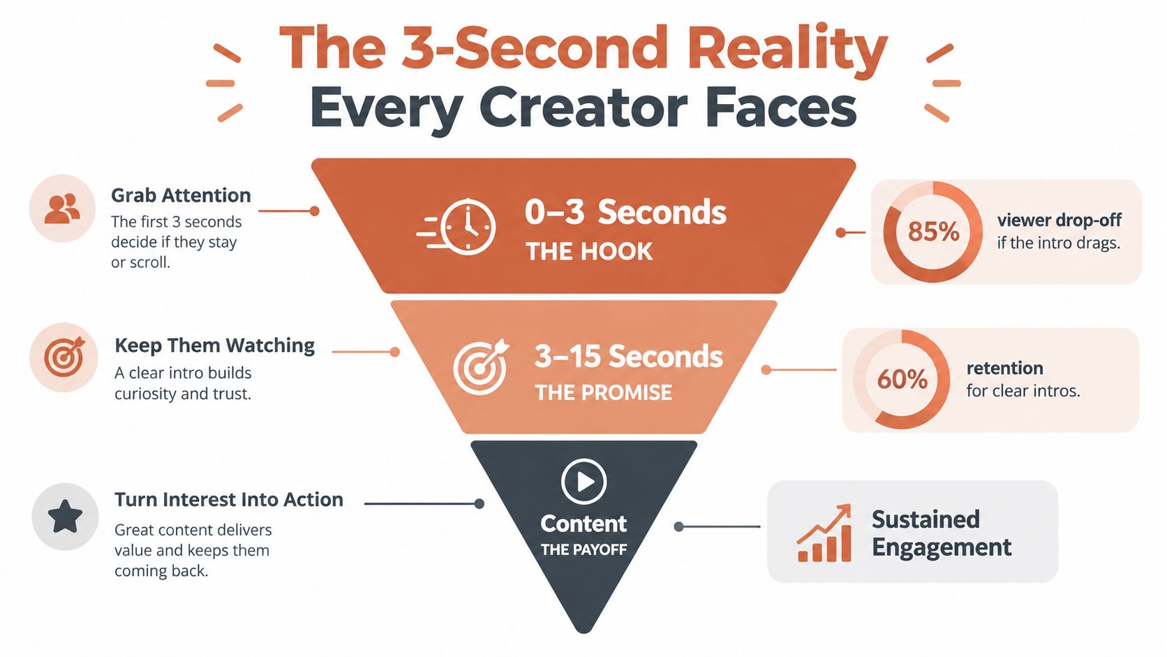
That timing changes the job of the intro. Your opening must communicate a reason to continue before the viewer has invested in the explanation. The reason may be a recognizable problem, a desired outcome, a revealing contrast, or a clear point of view. It does not need to be loud. It needs to be legible to this audience on this platform.
Use the opening as a performance diagnostic, not a template choice. Define what the viewer should understand immediately, then produce at least two materially different first beats. Compare their retention rather than choosing the version with the nicer animation or more polished typography. A clean intro that loses viewers remains a failed intro.
Fix the opening before rebuilding the whole video
When a sound video underperforms, creators often change the thumbnail, rewrite the caption, add transitions, or reshoot the middle. Those changes may help distribution or pacing, but they cannot repair a weak first beat. If viewers leave before the demonstration begins, the demonstration has no opportunity to work.
Audit the first moments without sound. Ask:
- What is visible first? Does the frame show the subject, problem, person, or only setup?
- What can the viewer infer? Can someone identify the topic before narration begins?
- What is promised? Does the opening point toward a concrete payoff, or announce that content is starting?
A useful intro sets expectations quickly. It identifies the experience ahead and gives the next moment a reason to exist. Review examples of snap-driven openings for a visual reference, then apply that discipline to your own first frame.
Practical rule: If the opening needs several seconds of explanation before its purpose becomes clear, move that explanation later.
Start by subtracting. Remove the greeting, move the logo, cut the title card, open on the result, or place the strongest line before the setup. The body may need no change. A sharper entrance can expose value the edit already contains.
Why Some Intros Hook and Others Flatten
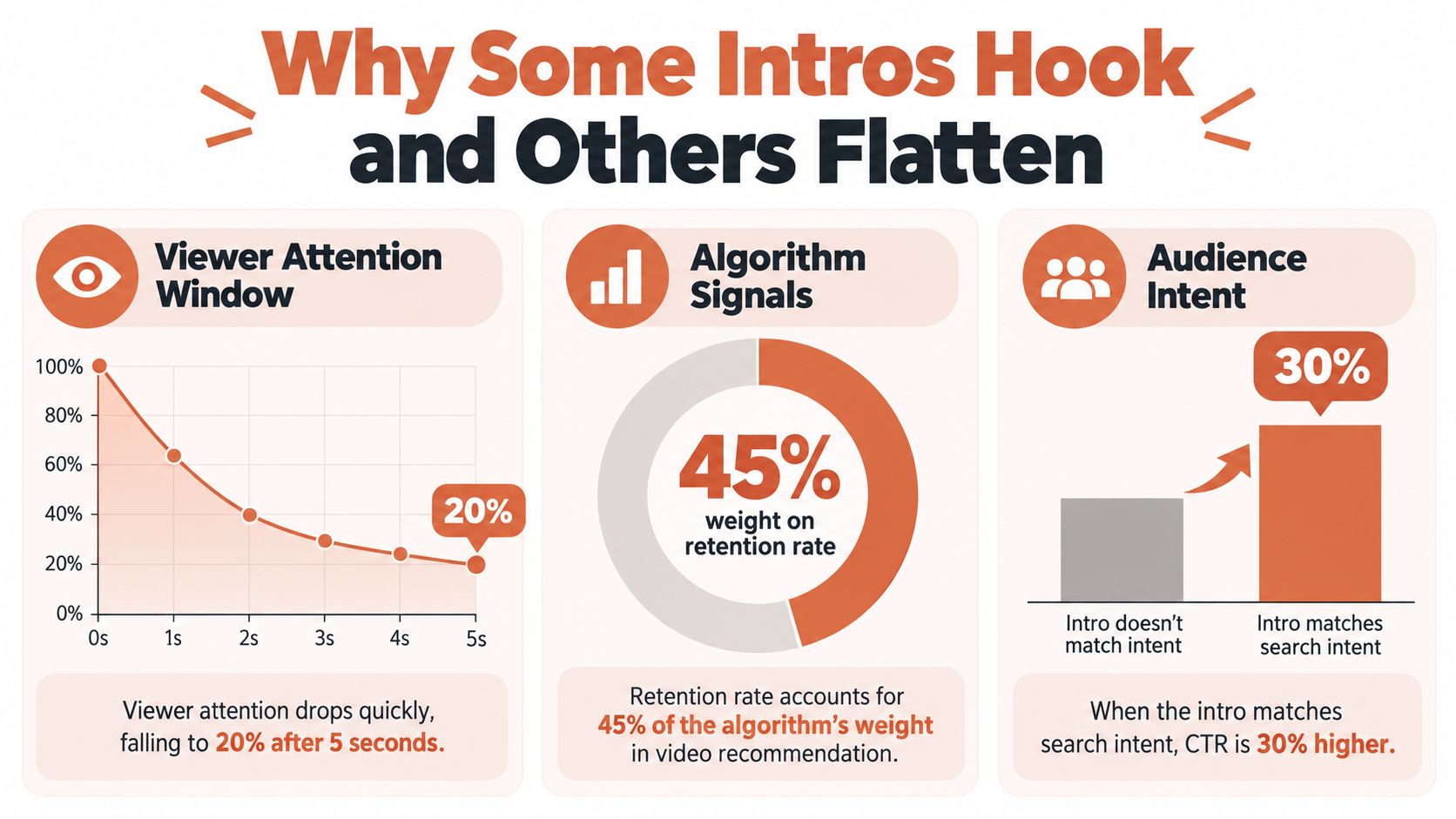
An intro competes against three conditions at once: the viewer’s limited attention, the platform’s distribution signals, and the intent that brought the audience to the screen. Ignore any one of them and a visually impressive opening can still fail.
A fast comedy hook may work for a passive social scroll because it creates immediate tension. The same opening can damage a LinkedIn product demonstration if it delays the business outcome. A brand film has more room to establish tone than a search-led tutorial, but it still needs a clear emotional or informational entry point.
Diagnose the audience before choosing the pattern
Start with the viewer’s job.
Someone searching for a product comparison wants evidence quickly. A person watching a talking-head tutorial may accept a direct statement if it names the problem accurately. A prospect encountering a paid ad needs a reason to believe the offer is relevant before a visual flourish earns attention.
The platform changes the surrounding conditions, too. Autoplay often begins without sound. Mobile interfaces cover parts of the frame. Search traffic brings a defined question, while recommendation feeds create a colder encounter. Your intro should answer the audience’s immediate question, not imitate whatever performed well in another category.
The early impression effect is real, but its evidence has limits. In a 2006 study published in Psychological Science, Princeton psychologists Janine Willis and Alexander Todorov found that judgments of unfamiliar faces after 100 milliseconds correlated highly with judgments made with unlimited viewing time. The study focused on facial perception, not video introductions, so it isn’t a precise rule for every setting. It does support a useful creative principle: viewers begin evaluating warmth, credibility, and competence almost immediately. The study record provides the relevant boundary.
Measure the opening as a sequence
Don’t ask only whether the video “feels engaging.” Track the first-3-second hold rate, 10-second retention, average percentage viewed, and completion rate by audience segment or traffic source. These measurements help separate an attractive opening from one that creates the right expectation.
If the first-3-second hold is weak, inspect the first visual and first line. If viewers stay briefly but leave around the explanation, the promise may be unclear or unsupported. If retention is solid but clicks are poor, the intro may entertain without directing attention toward the next action.
For teams building paid creative, creative testing frameworks for ads can help organize hypotheses instead of treating every variant as a subjective design review. The principle applies beyond ads: name the intended behavior, isolate the opening variable, and compare like with like.
A good diagnostic brief therefore says more than “make it punchier.” It says, “We need qualified viewers to recognize the product problem immediately and continue into the demonstration.” That sentence gives the editor a decision criterion.
Planning the Intro Before You Open an Editor
The fastest way to waste production time is to open Premiere Pro, CapCut, or After Effects before deciding what the opening must accomplish. Editors are excellent at arranging material. They can’t choose the promise for you.
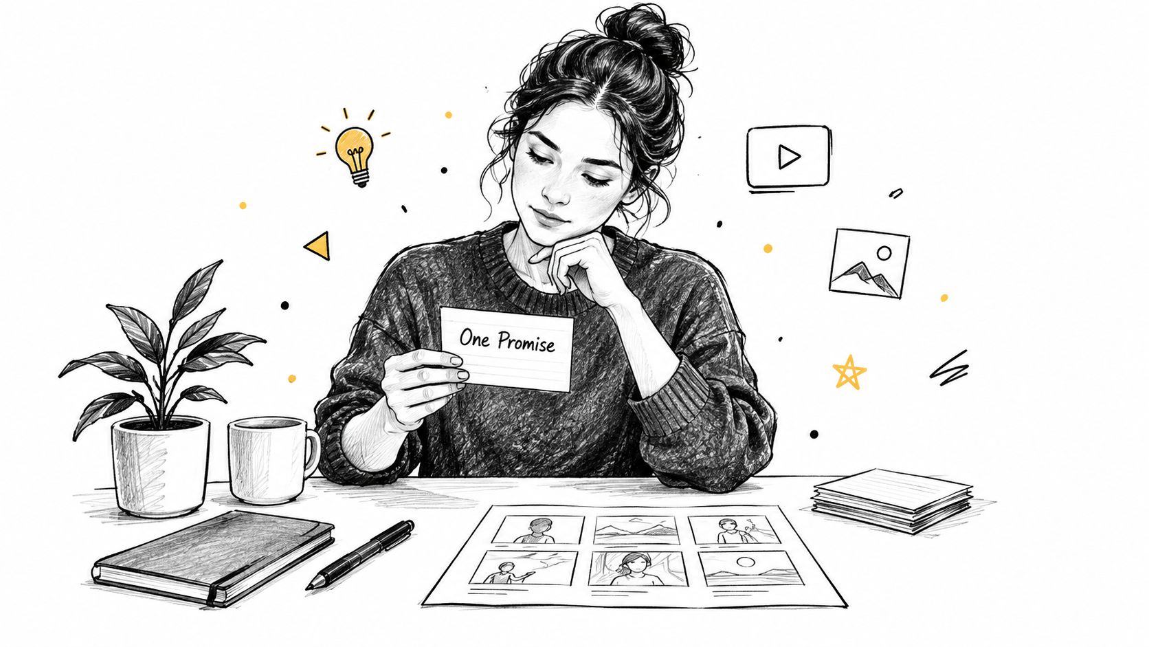
Write one sentence that describes the video’s single value:
“After watching, [specific audience] will understand or do [specific outcome].”
If the sentence contains several outcomes, split the project or choose one. A product video might promise, “DTC shoppers will see how this bottle prevents leaks in a gym bag.” A tutorial might promise, “New marketers will learn how to diagnose a weak landing-page headline.” Those promises suggest different first visuals.
Write one hook that can survive three formats
Draft a verbal hook of about 15 words. Then test it three ways:
- Spoken: Can a person deliver it naturally without rushing?
- On-screen: Can someone read it comfortably while the visual changes?
- Captioned: Does it still make sense if the viewer watches without audio?
A strong hook names the problem or outcome without explaining the entire mechanism. “Your product photos look fine, but they’re hiding the detail shoppers need” creates a reason to continue. “Welcome back to another exciting product photography video” doesn’t.
Lock the primary platform before designing. Choose the aspect ratio, expected viewing environment, and opening duration based on where the asset will live. A vertical social cut, a presentation opener, and a square feed ad shouldn’t share identical framing merely because the footage is the same.
Map the opening against the payoff
Create a rough timeline with three labels: promise, proof, payoff. The intro should point toward the proof without spending the proof too early. If the result is the entire reason to watch, show enough of it to establish credibility, then preserve the fuller reveal for the body.
Toastmasters International’s history illustrates why this work is teachable rather than mystical. Ralph C. Smedley formed the first official Toastmasters club in Santa Ana, California, in 1924, and Toastmasters now reports nearly 8 million members across 148 countries and territories. Toastmasters’ account of its history connects speaking improvement with preparation, delivery, feedback, and revision.
Turn the finished brief into a reusable prompt or storyboard template. Include the audience, promise, platform, visual evidence, tone, brand constraints, and success metric. A storyboard-to-product-ad walkthrough shows the kind of translation required when a concept becomes a production asset. Planning once should give you a system for producing and revising many openings, not just a single draft.
Four Intro Archetypes That Work in 2026
No archetype wins everywhere. The useful question is which opening matches the viewer’s intent and the action you need next.
Problem first
Lead with the pain the audience already recognizes. Show the leaking package, the confusing dashboard, or the crowded calendar in the first visual beat.
Strong: “Your ad gets clicks, but shoppers leave before they see the product detail.” The screen immediately shows a landing page with the relevant detail buried below the fold.
Weak: “Are you struggling with your marketing?” The question is broad enough to fit almost anyone, which means it gives nobody a specific reason to stay.
The trigger is recognition. Problem-first openings work when the audience feels the problem now and expects a practical solution.
Result first
Show the finished outcome before explaining how it happened. A product demo can open on the sealed package surviving a drop, then cut back to the design choice that made it possible.
Strong: Begin with the completed room, edited image, or working dashboard, then say, “This was the change that made it usable.”
Weak: Show a polished result with no explanation of why it matters. Beauty can stop a scroll, but without a relevant promise it may not sustain attention.
The trigger is desire and proof. Result-first is especially effective when the outcome is visually obvious and the process contains a satisfying reveal.
Curiosity gap
Create a specific unanswered question, preferably through contrast. “The most expensive part of this ad isn’t the video” gives the viewer a reason to find the missing explanation.
Strong: Show two nearly identical product pages and identify one small difference that changes the buying experience.
Weak: “You won’t believe what happens next.” The phrase creates suspense without telling the viewer whether the subject matters to them.
The trigger is tension between what the audience sees and what it wants explained. Curiosity should narrow attention, not manufacture confusion.
Brand reveal
Lead with identity, tone, or a distinctive visual language. This is useful for brand films, recurring series, and campaigns where recognition itself supports the objective.
Strong: A characteristic sound, color treatment, and product detail appear together, followed by a line that states the brand’s point of view.
Weak: A long animated logo plays before the viewer knows what the content offers. Branding becomes an obstacle when it asks for attention before earning relevance.
For spoken introductions, a structured sequence can reduce ambiguity: attention-getter, connection to the subject, audience relevance, credibility, thesis, and preview. The public-speaking guidance on introductions supports this sequence as a repeatable way to orient an audience.
| Archetype | Best For | Typical Goal | Risk If Mishandled |
|---|---|---|---|
| Problem first | Tutorials, service ads, search-led content | Retention and qualified attention | The problem feels generic |
| Result first | Product demos, transformations, case-led creative | Clicks and product interest | The result lacks context |
| Curiosity gap | Explainers, comparisons, commentary | Watch-through and shares | The promise feels manipulative |
| Brand reveal | Campaign films, recurring series, premium assets | Recognition and emotional connection | Branding delays relevance |
Choose one primary archetype per variant. Mixing all four into a single opening usually produces a crowded message with no clear job.
Building the Intro in Motion, Text, and Sound
Production order affects performance. Start with timing and a plain cut before adding effects. If the opening feels slow without animation, motion will only hide the problem temporarily. Build the intro around the viewer’s first decision: understand the promise, recognize the subject, or continue watching.
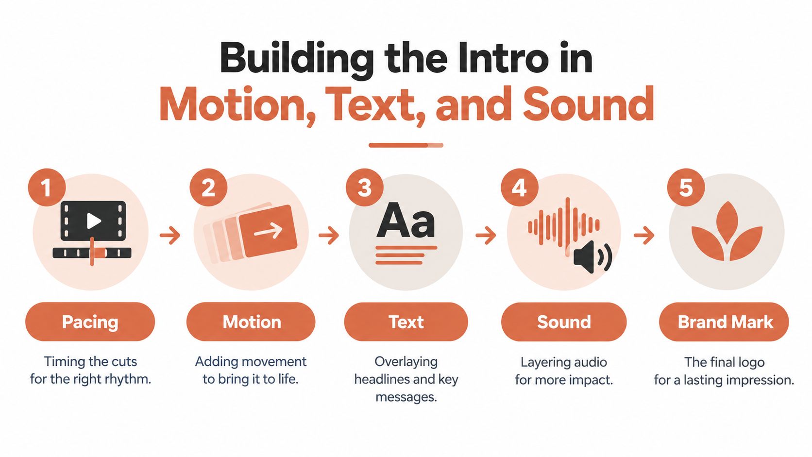
Start with pacing
Place the strongest visual and clearest line at the front of the timeline. Test hard cuts before transitions. Fast social edits often need tight opening cuts, but a fixed rhythm can damage comprehension. A close-up of a product mechanism may need stillness so the viewer can see how it works.
Watch the first pass muted. Because the decision window is brief, the visuals must communicate the promise without narration. If the story vanishes, add clearer action, framing, or on-screen language before reaching for another effect. Review the opening as a performance test, not a design showcase.
Add motion with a purpose
Motion should direct attention toward evidence. Use a hand entering frame, a product rotation, a screen recording that begins on the relevant control, or a controlled push toward the subject. Kinetic type can change position, scale, or rhythm to create energy. Animated type can fade or slide into place. Both approaches work when they support the spoken hook rather than compete with it.
Text must survive mobile viewing. Keep headlines inside platform-safe regions, use strong contrast, and keep important words clear of interface controls. Shrinking the type is usually the wrong fix. Rewrite the line until it fits comfortably and remains readable at a glance.
Layer sound, then brand
Build dialogue or the central audio cue first. Add music and sound effects beneath it, checking that the first spoken phrase remains clear. A cut can gain force from a precise sound effect, but music should not carry meaning that the visuals fail to deliver. Review the voiceover and captions workflow while applying the same silent-first check.
Place the logo where it supports recognition without interrupting the promise. A product mark can belong inside the opening visual when it helps identify what the viewer is seeing. A separate credit sequence makes sense only when the brand reveal is the content’s actual purpose.
For high-stakes launches, video animation studios can translate a brand system into consistent motion language. Set the pacing first, then define visual behavior, typography, sound, and brand restraint. Build side-by-side versions when the opening choice is uncertain, then judge them by retention rather than personal taste.
Testing Variants and Picking the Winner
A finished intro is a hypothesis. Treat it that way.
Take one locked brief and produce several variants without changing the body. One can be problem-first, one result-first, and another built around a human face or product close-up. Keep the strategic difference visible in the file name and review notes:
- Variant A: The problem appears first, hypothesis is immediate recognition will improve the opening hold.
- Variant B: The result appears first, hypothesis is visible proof will create stronger continuation.
- Variant C: The presenter delivers the promise directly, hypothesis is personal relevance will outperform abstract visuals.
Don’t change the music, caption style, body edit, and call to action at the same time. If you do, you won’t know which decision affected the outcome. Publish through a controlled A/B test where available, or use staggered posts while documenting traffic source and audience context.
Read the first-3-second hold rate before celebrating views. Then inspect the 10-second retention curve, average percentage viewed, and completion rate for the audience segment that matters. A variant that attracts attention but loses qualified viewers may be a weaker business asset than one with a quieter opening and stronger continuation.
The winner isn’t the version the creative team likes best. It’s the opening that produces the healthiest evidence for its stated objective. Preserve that structure as a brand-safe template, then test the next variable rather than starting from an empty timeline every week.
Export Settings and a Pre-Publish Checklist
Export for the screen that will display the intro. Confirm the platform’s required aspect ratio, resolution, file format, codec, and bitrate before rendering. A smaller file may upload faster, while a higher bitrate can preserve fine product detail. Choose the balance that keeps text and edges clean without creating an unnecessarily heavy asset.
Decide whether captions are burned into the video or supplied as a separate caption file. Burned-in captions guarantee visibility across placements, but they can’t be turned off and may need separate language versions. Sidecar captions offer flexibility, but the platform must support them and the viewer must receive them correctly.
Before publishing, check:
- Frame safety: Keep essential text and logos away from interface areas on TikTok, Reels, Shorts, and LinkedIn.
- Silent comprehension: Confirm that the promise remains understandable without audio.
- Readable type: Review the opening on a small mobile screen, not only on an editing monitor.
- Contrast: Test captions and headlines against the actual footage behind them.
- Pacing: Make sure text stays visible long enough to read.
- Brand restraint: Ensure the logo supports recognition without crowding the hook.
- Audio meaning: Use sound design to reinforce the message, never to carry information the visuals omit.
Your intro is the contract you make with the viewer in the first few seconds. Export settings determine whether that contract arrives clearly, and retention data tells you whether the opening kept it.
CreativeClaw lets you brief, generate, compare, edit, and refine intro variants across image, video, voice, music, and sound models inside your AI assistant, while Brand Kits help keep logos, colors, fonts, and style consistent. Create several openings from one production brief, compare the strategic directions, and visit CreativeClaw to turn the strongest version into a reusable workflow.
Ready to try it?
Connect CreativeClaw to Claude in under a minute.
Get StartedContinue the workflow