Creating How to Videos That Actually Get Watched

A tutorial can look polished, sound confident, and still lose most of its audience before the first useful step. The usual culprit isn’t the camera. It’s the gap between what the viewer clicked to learn and what the video makes them wait to receive.
How-to video deserves more strategic treatment than a simple information dump. People search for how-to and educational videos when they are trying to finish a task, so instructional video can educate, qualify, and convert when the structure respects the viewer’s time.
Table of Contents
- Why Most How To Videos Lose Viewers Before the Payoff
- Choosing the Right Format and Length Before You Hit Record
- Scripting and Storyboarding a Single Learning Objective
- Recording Setup That Matches Where the Video Will Live
- Editing for Retention With Captions and On-Screen Cues
- Reading Retention Data and Iterating the First 30 Seconds
- Distributing as a Multi-Format System With Brand Consistency
Why Most How To Videos Lose Viewers Before the Payoff
The frustrating version of this problem is familiar. The lighting is clean, the script reads well, the screen recording is sharp, and the finished video feels professional. Then the retention graph drops before the actual demonstration begins.
That usually happens for three structural reasons.
The introduction answers the wrong question
Creators often open with credentials, context, or a summary of what the viewer is about to see. Those details may be useful later, but they don’t answer the viewer’s immediate question: what will I be able to do if I keep watching?
A stronger opening shows the result first. Put the finished dashboard, edited image, repaired object, or working workflow on screen immediately, then explain the shortest path to it. The viewer shouldn’t have to sit through a brand greeting before seeing evidence that the tutorial can solve the problem.
Practical rule: Show the outcome before you explain the process.
One video tries to teach too much
“Learn video editing” isn’t a learning objective. “Remove background noise from a talking-head clip” is. Broad subjects create broad scripts, and broad scripts create long introductions, too many examples, and a weak sense of progress.
Write the outcome as one sentence:
“By the end of this video, the viewer can [perform one action] without [the main obstacle].”
If the sentence contains several verbs, split the idea. A tutorial about setting up a complete content system may become separate videos for planning, recording, editing, captioning, and distribution.
Viewers can’t tell where they are
Instruction becomes tiring when the audience has to remember every step without visual assistance. Number the actions on screen. Label the tool being used. Use a short chapter card when the video changes phase. Highlight the cursor, fingertip, menu item, or object that matters.
The best how-to videos create visible progress. The viewer knows which step they’re watching, what has already happened, and what remains. That clarity reduces the effort required to follow along.
A two-speed workflow solves much of this. Create a short, hook-first clip for discovery, then a longer, structured tutorial for people who want to complete the task. The short version earns attention by showing the result or the most surprising step. The longer version earns trust by slowing down only where detail is necessary.
Choosing the Right Format and Length Before You Hit Record
One topic shouldn’t automatically produce one upload. A useful tutorial system starts with a core lesson, then shapes that lesson for different levels of intent.
Short vertical clips are discovery assets. They should communicate one idea quickly, show the result, and make the next step obvious. A mid-length tutorial handles the complete learning objective. A deeper walkthrough serves viewers who already care enough to compare options, troubleshoot edge cases, or evaluate a product.
Recent trend coverage describes this split as a practical workflow of 15 to 45 second clips for one idea, 60 to 180 second explainers for education, and 8 to 20 minute demos or webinars for depth. Those ranges appear in the video trends analysis from Clipchamp, and they work as planning bands rather than rigid platform rules.
| Platform | Recommended Length | Aspect Ratio | Primary Use |
|---|---|---|---|
| TikTok | 15 to 45 seconds for a single idea | Vertical | Reach and fast discovery |
| Instagram Reels | 15 to 45 seconds for a focused tip | Vertical | Reach, saves, and repeat viewing |
| YouTube Shorts | 15 to 60 seconds for a hook or micro-demo | Vertical | Search-adjacent discovery and channel entry |
| 60 to 180 seconds for a business explanation | Square or vertical | Professional education and discussion | |
| YouTube long-form | 8 to 20 minutes for a deep demonstration | Horizontal | Trust, search intent, and conversion |
| Embedded web tutorial | 3 to 6 minutes for one task | Horizontal or responsive | Product education and task completion |
The six-minute mark is a useful practical ceiling for a self-contained learning segment. Research on educational video recommends segmenting instruction, and a MOOC study summary found that videos under six minutes maintained median engagement close to the full video length, while clips under three minutes had the highest engagement. The research summary on educational video engagement supports a simple production choice: keep one objective short, then split a larger lesson into chapters or companion videos.
The format decision belongs in pre-production. Write the destination beside each shot in the brief. A vertical close-up may be excellent for Reels but unusable in a horizontal course. A wide screen recording may work on YouTube but become unreadable after a vertical crop.
For longer tutorials, document the relationship between the master edit and its cutdowns. A practical long-form video workflow can help teams treat the longer version as source material rather than as the only finished asset.
Scripting and Storyboarding a Single Learning Objective
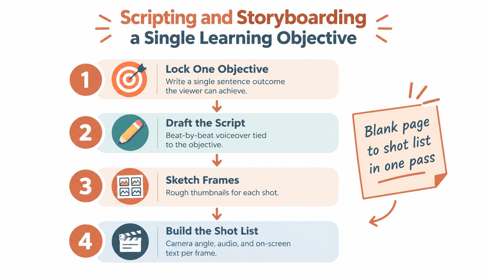
Start with the viewer’s action, not the subject. “How to use a spreadsheet” is a topic. “Create a filter that shows overdue tasks” is a usable objective.
Write one sentence and refuse to record until it is specific:
Outcome: “After watching, the viewer can create an overdue-task filter in the project spreadsheet.”
That sentence controls the script, the screen capture, the B-roll, and the call to action. It also gives you a clean reason to remove anything interesting but irrelevant.
Build the script in three beats
The cold open shows the finished result. Don’t describe the filter before showing it. Put the completed view on screen and say what changed.
The numbered middle breaks the process into visual chunks. Each chunk should answer one question, such as where to click, what value to enter, or how to confirm that the result worked.
The recap close confirms the outcome and points to the next logical lesson. It can be brief, but it should give the viewer a reason to continue rather than ending with a generic sign-off.
A 60-second outline might look like this:
- 0 to 3 seconds: Show the filtered spreadsheet and state the outcome.
- 3 to 10 seconds: Identify the column and open the filter control.
- 10 to 25 seconds: Choose the overdue condition and enter the value.
- 25 to 42 seconds: Apply the filter and show the resulting rows.
- 42 to 52 seconds: Mention the common mistake, such as filtering the wrong column.
- 52 to 60 seconds: Recap the action and direct viewers to the next related tutorial.
The exact timing can change. The sequence shouldn’t. Put the payoff on screen early, then let every shot earn its place.
Use a rough storyboard, not a beautiful one
A storyboard only needs to reveal missing shots before the camera is running. Create one row for each visual change:
| Frame | Viewer sees | Voiceover | On-screen cue | Required asset |
|---|---|---|---|---|
| 1 | Finished filtered view | State the outcome | “Show overdue tasks” | Screen capture |
| 2 | Filter menu opens | Name the control | “Step 1, open Filter” | Cursor highlight |
| 3 | Condition selected | Explain the choice | “Choose overdue” | Close screen crop |
| 4 | Final result | Confirm success | “Check the filtered rows” | Result capture |
This rough pass catches the shots creators most often forget, including the finished result, the close-up of a small interface control, and the mistake that needs a visual example. For a repeatable planning process, a storyboard-to-video workflow can turn the same structure into a reusable production brief.
Recording Setup That Matches Where the Video Will Live
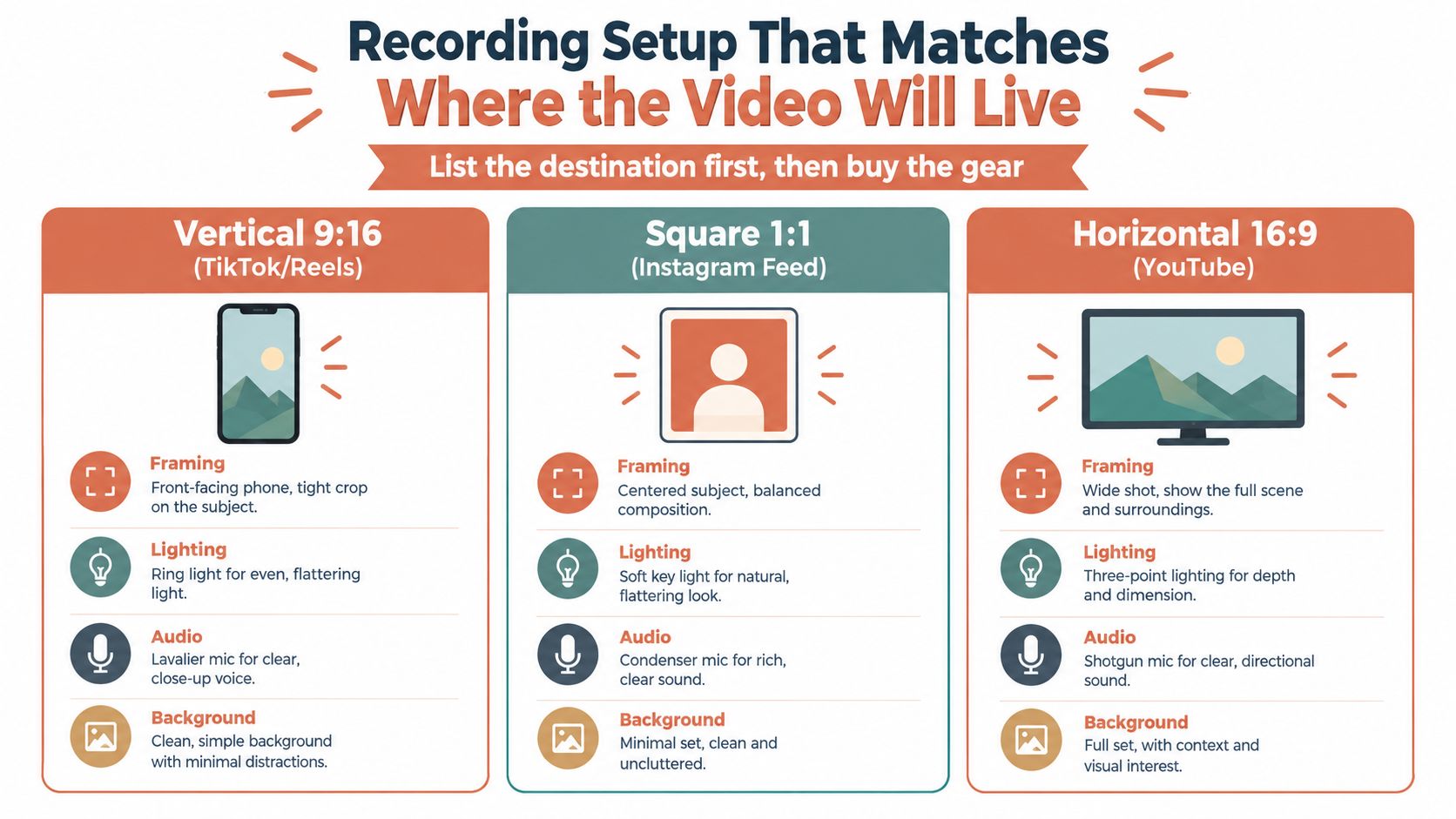
Buy and place equipment after deciding where the video will appear. The destination determines the frame, the amount of visible workspace, the microphone position, and how much room you need for captions or interface labels.
A vertical phone video needs a tight composition that survives a narrow frame. Place the tripod around chest height, keep the subject close enough to read, and leave intentional space for captions. A horizontal YouTube walkthrough can show more of the desk, a wider two-shot, or a complete screen-and-presenter relationship. Square video benefits from a centered subject and a controlled background because the frame gives you less room to hide distractions.
Choose the microphone for the movement
A lavalier microphone suits a talking-head clip where the presenter moves slightly or needs a clean, consistent voice. A shotgun microphone works well for an over-shoulder demonstration when the microphone can stay just outside the frame. A USB condenser microphone is practical for a seated screencast where the speaker stays near the desk.
Room sound matters more than expensive camera hardware. Record a short test, listen for air conditioning, keyboard noise, echo, and clothing rustle, then fix the loudest problem before filming the full lesson. Clean audio makes instructional pacing easier to follow, especially when the screen content is dense.
Light for separation and readability
A single key light placed to one side of the face usually creates more depth than a flat light directly beside the camera. A window can serve as a useful source if its intensity stays stable. Add a practical lamp or a small fill only when the background or shadow needs control.
The setup should match the table, not the other way around. If the first destination is vertical, film a composition that protects the subject and the important action inside the 9:16 frame. Reframing that footage for horizontal use may leave empty space, but filming horizontal first and cropping aggressively for vertical often removes the hands, interface, or product detail that makes the tutorial useful.
Editing for Retention With Captions and On-Screen Cues
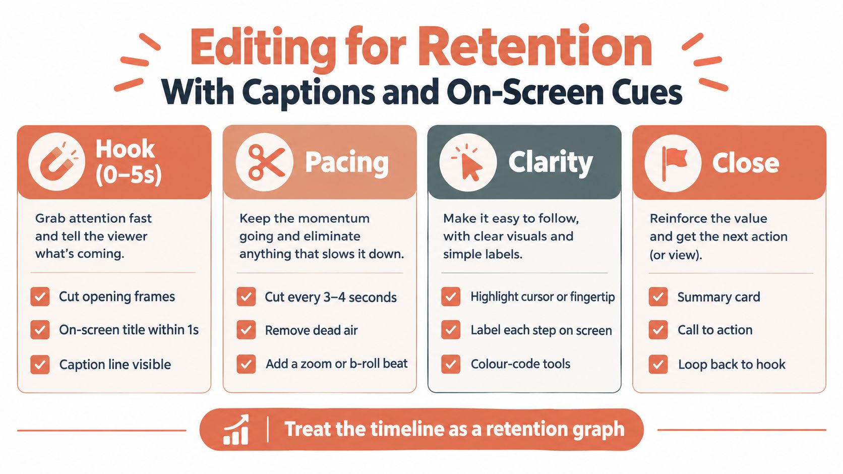
Edit for continued understanding, not for visual smoothness. A clean transition can still waste time, while a hard cut can improve the lesson if it removes hesitation, repetition, or an unnecessary setup step.
Educational-video research recommends segmenting instruction and indicates that videos of six minutes or less can reduce cognitive load and improve learning efficiency. Use that finding as an editorial warning rather than a universal rule. If the viewer needs more time, split the lesson, change the visual mode, or give them a deliberate checkpoint.
Make the timeline communicate progress
For short clips, remove every pause that doesn’t create suspense, clarity, or emphasis. For longer pieces, introduce a meaningful visual change when the viewer needs help processing a new idea. That change might be a screen crop, a highlighted cursor, B-roll of the physical action, a chapter label, or a return to the presenter.
Captions should be a default production layer, not an accessibility task left until the upload screen. Use video captioning best practices to improve transcription accuracy, timing, line breaks, and readability. Then edit the captions as part of the lesson itself.
Useful caption treatments include:
- Keyword emphasis: Highlight the exact tool, command, or setting the viewer needs to remember.
- Step labels: Keep “Step 2” visible while the relevant action happens.
- Speaker labels: Identify speakers when a demonstration uses dialogue or contrasting voices.
- Lower-third recaps: Summarize the action without forcing the viewer to replay the explanation.
- Visual targeting: Add a circle, cursor glow, or fingertip highlight when the important detail is small.
Don’t cover the interface with decorative graphics. Captions, labels, and pointers should reduce search effort. If the viewer has to hunt through competing colors and animations, the edit has become an obstacle.
The fastest useful cut is usually better than the smoothest unnecessary transition.
A polished edit often fails because it protects dead air. Remove the repeated sentence, shorten the explanation, and cut into the action sooner. The viewer came for a result, so the timeline should keep proving that the result is getting closer.
Reading Retention Data and Iterating the First 30 Seconds
The audience-retention report is the most honest version of the edit room. It shows where viewers stopped following, even when the creator felt that a section was clear.
A cliff near the opening usually means the promise arrived too late or sounded too vague. Rewrite the cold open so the result appears immediately and the outcome is stated in the first few seconds. If viewers leave during a personal introduction, move that context after the first useful action or remove it.
A steady decline points to pacing or cognitive overload. Cut repeated explanations, shorten pauses, and add a visual change when the lesson shifts. A sudden dip between the introduction and the demonstration often means the handoff wasn’t signposted. Add a chapter card, a spoken transition, or a preview of the next action.
Match the fix to the shape
| Retention pattern | Likely problem | Practical edit |
|---|---|---|
| Early cliff | Weak promise or delayed result | Show the finished outcome first |
| Smooth downward slide | Slow pacing or excess explanation | Remove repetition and shorten setup |
| Dip at the demo transition | Missing signpost | Label the next step before switching views |
| Drop during a dense step | Too much information at once | Split the action and highlight one control |
| Stable viewing, weak completion | Ending lacks a reason to continue | Add a clear recap and next-step prompt |
YouTube recommends checking audience-retention reports and comparing a video’s performance with videos of similar length. A multi-niche analysis reported an average retention rate of 23.7%, and only 16.8% of videos exceeded 50% retention, according to the retention analysis from PandaVideo. Those figures are useful as context, not as a target detached from topic, audience, and length.
Build an iteration loop around the evidence. Publish, inspect the curve once enough viewing data exists to reveal a pattern, identify the worst 30-second window, and change that window in the next cut. Judge the pattern across several uploads rather than treating one unusual curve as a verdict.
The goal isn’t a dramatic spike. It is a flatter line, especially through the opening. A tutorial that steadily keeps qualified viewers is more useful than one with a brilliant first moment and a confusing middle.
Distributing as a Multi-Format System With Brand Consistency
Repurposing isn’t uploading the same video everywhere. It is translating one lesson into several viewing situations.
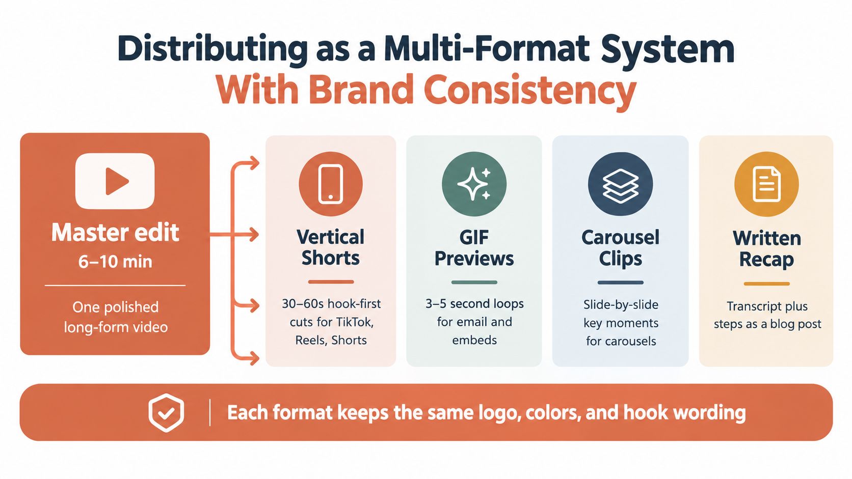
Start with a master edit that contains the complete explanation. From it, create a hook-first vertical clip, a short preview loop, a sequence of carousel frames, and a written recap. Each version should have its own opening because the viewer’s context changes by platform.
A short feed clip should lead with the most surprising result or the most visually obvious transformation. A LinkedIn version may use a direct talking-head explanation with captions and a professional example. An email version can reduce the lesson to a few practical points beside a thumbnail that links to the full tutorial.
Keep one source of truth
Store the master edit, vertical cuts, caption file, transcript, thumbnail variations, and social copy in the same project folder. Name each asset by lesson and format, not by whatever export name the editor happens to create. That small discipline prevents the wrong caption file, old logo, or unfinished cut from reaching a distribution queue.
A useful folder might contain:
- Master video: The complete lesson with clean audio and a version without platform graphics.
- Short variants: Hook-first cuts with platform-specific framing and captions.
- Thumbnail system: A consistent layout tested at small size.
- Caption files: A corrected subtitle file plus burned-in versions where needed.
- Transcript and recap: The source for the blog post, email, and carousel.
- Publishing copy: Titles, descriptions, timestamps, tags, and pinned comments.
Modular production beats repeated shooting. Capture clean source footage, record alternate hooks when practical, and keep reusable overlays, sound treatments, and lower-thirds available for future edits. The production team should be able to make a new variant without rebuilding the visual identity from memory.
Brand consistency isn’t just a logo in the corner. Reuse a recognizable color palette, font, lower-third treatment, intro sting, and presenter or character style. A saved Brand Kit and Character Kit can preserve those choices across generated and edited variants. A remote MCP workflow can also connect briefing, asset generation, revisions, and exports inside the assistant conversation, reducing the drift that appears when every version is created in a different tool.
Recent industry coverage identifies personalization, localization, and character-consistent video as important patterns in the projected 2026 creative workflow, while noting that creative direction matters more as production becomes easier. The analysis of AI video and social media trends supports a governance point that beginners often miss: producing more variants only helps if the instructions, identity, and visual rules remain stable.
Adapt the hook, not the lesson
The central teaching should stay consistent. The framing should change.
For a short-form feed:
- Open with the finished result.
- Name the single action that created it.
- Demonstrate the most useful step.
- Point to the full tutorial or next clip.
For a professional network:
- State the operational problem.
- Show the consequence of leaving it unresolved.
- Demonstrate the workflow.
- Give the viewer a practical next action.
For email:
- Explain who the lesson helps.
- Summarize the action in a few bullets.
- Link the thumbnail to the complete video.
Good strategic content distribution treats every cut as a deliberate entry point, not as leftover footage. The same approach applies to a reusable social campaign system where the master lesson, variants, copy, and publishing assets remain connected.
Run the publishing check
Before uploading, verify the following:
- Hook: The result or problem appears in the opening moments.
- Objective: The video teaches one clear action.
- Captions: Captions are burned in or uploaded as a corrected subtitle file.
- Thumbnail: The main subject and promise remain legible at small size.
- Title: The title uses the verb the viewer wants to perform.
- Description: The description includes useful jump points for longer videos.
- Next step: The pinned comment or closing line directs viewers to a relevant lesson.
- Consistency: Logo, color, type, presenter, and terminology match the rest of the series.
- Retention review: The opening curve doesn’t show an avoidable cliff.
Raw production polish is not the main lever. A clear, well-captioned, properly distributed tutorial can keep working across several surfaces, while a cinematic video that appears rarely has fewer opportunities to teach or convert. Treat each how-to as a seed asset, inspect its retention pattern, and use the findings to make the next lesson more focused.
CreativeClaw offers prompt- or script-based video creation, scene generation, narrated explainers, voiceover, and word-timed captions through connected creative tools, which can support a modular workflow when the brief and brand rules are already defined. Visit CreativeClaw to explore a workflow for turning one structured tutorial brief into consistent video variants, captions, and supporting assets.
Ready to try it?
Connect CreativeClaw to Claude in under a minute.
Get StartedContinue the workflow